AUDENTIFY FOR SPOTIFY
Role: UX Researcher, UI Designer
ADDING A FEATURE
Spotify is currently the popular choice based on the number of users. However, they would still like to use empathy and research to continue adding features. User Interviews have been scheduled along with an online survey to help get deeper into the minds of music streamers.
Our goal is to locate music streamers and gain some insight into how they use music streaming in everyday life.
Even when things are agreeable, there will always be some recommendations on making the experience even better.
Our time will be spent learning all the small and large demands that could & should be met.
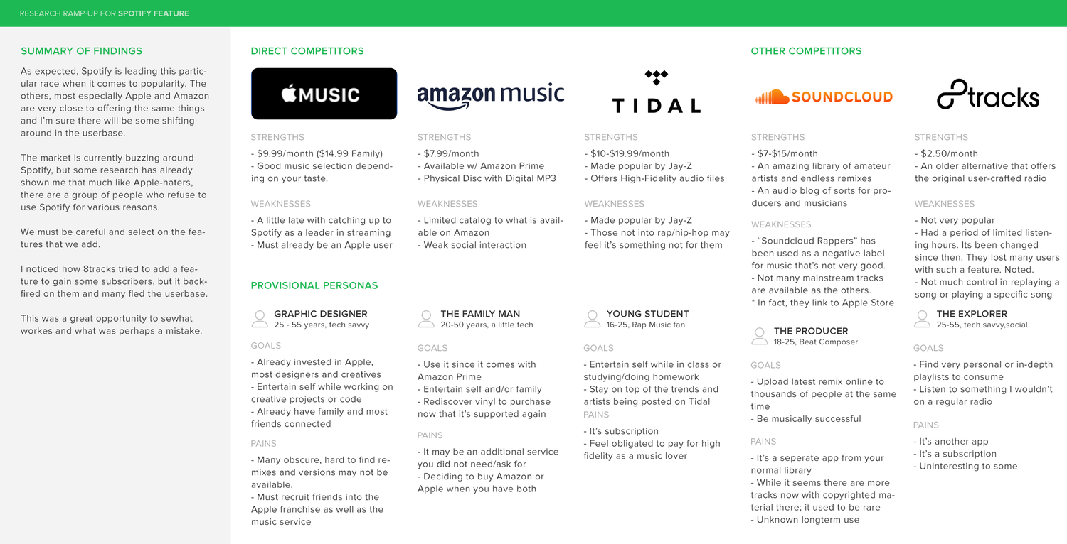
COMPETITIVE ANALYSIS
I set my sight on the most established agencies that would currently attract our desired users. After completing the competitive analysis, we were able to see what is working out well for our competitor's, and also what may not be worth our time & investment. This research not only helped core functionality, but many design patterns were inspired from these very well-designed websites.
1:1 USER INTERVIEWS
Discovering the habits and behaviors of our users will provide the information required to build a design created just for them. Learning their wants and needs (as well as their pain-points) will help create an easy and pleasant system to find, and ultimately purchase what products they require. Also learning what kind of products they already have or plan to have will give us a better insight into what insurance bundles make the most sense for this target demographic. I felt it was necessary to have actual conversations with some potential users and included 1-on-1 user interviews to our primary research.
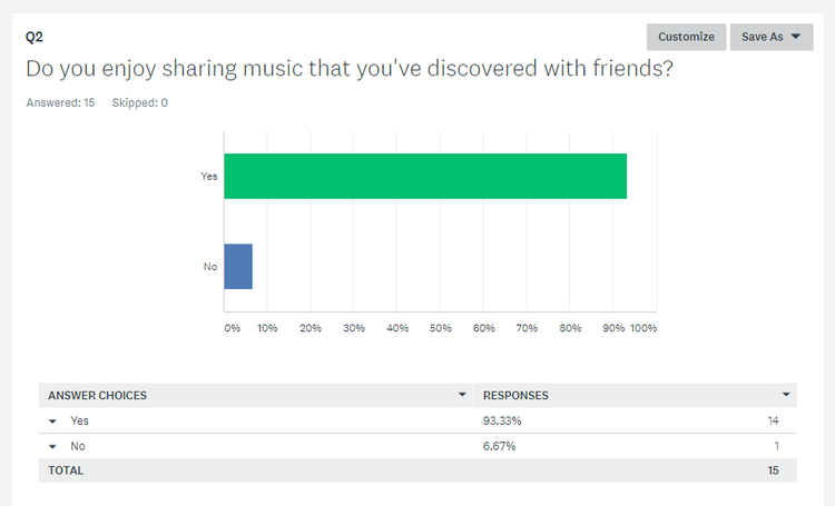
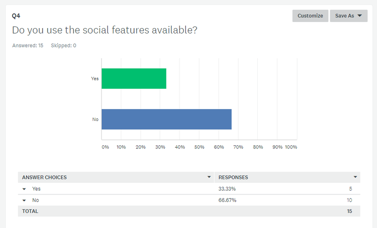
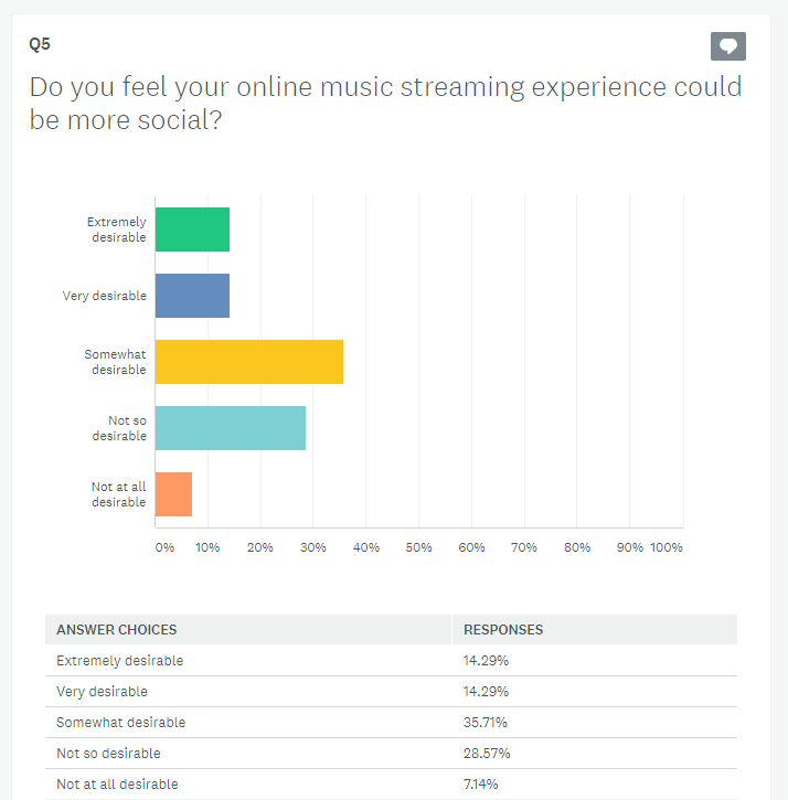
The results showed us that the majority of users definitely enjoy sharing music with their friends, but they are not using the social features to do so. In one interview it was stated that ‘I like to share in person, to a person - rather than a broadcasted tweet.” The more information received the clearer the picture got. This showed a much more private/personal approach to music streaming. In fact, when asked about whether or not their experience could be more social - there were actually some users saying “It’s
not desirable at all.”
Using word recognition in the user surveys, I was able to catch a common feature that was requested.
A feature that not only can be used by other musicians but everyone.
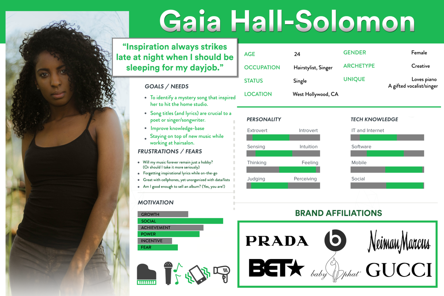
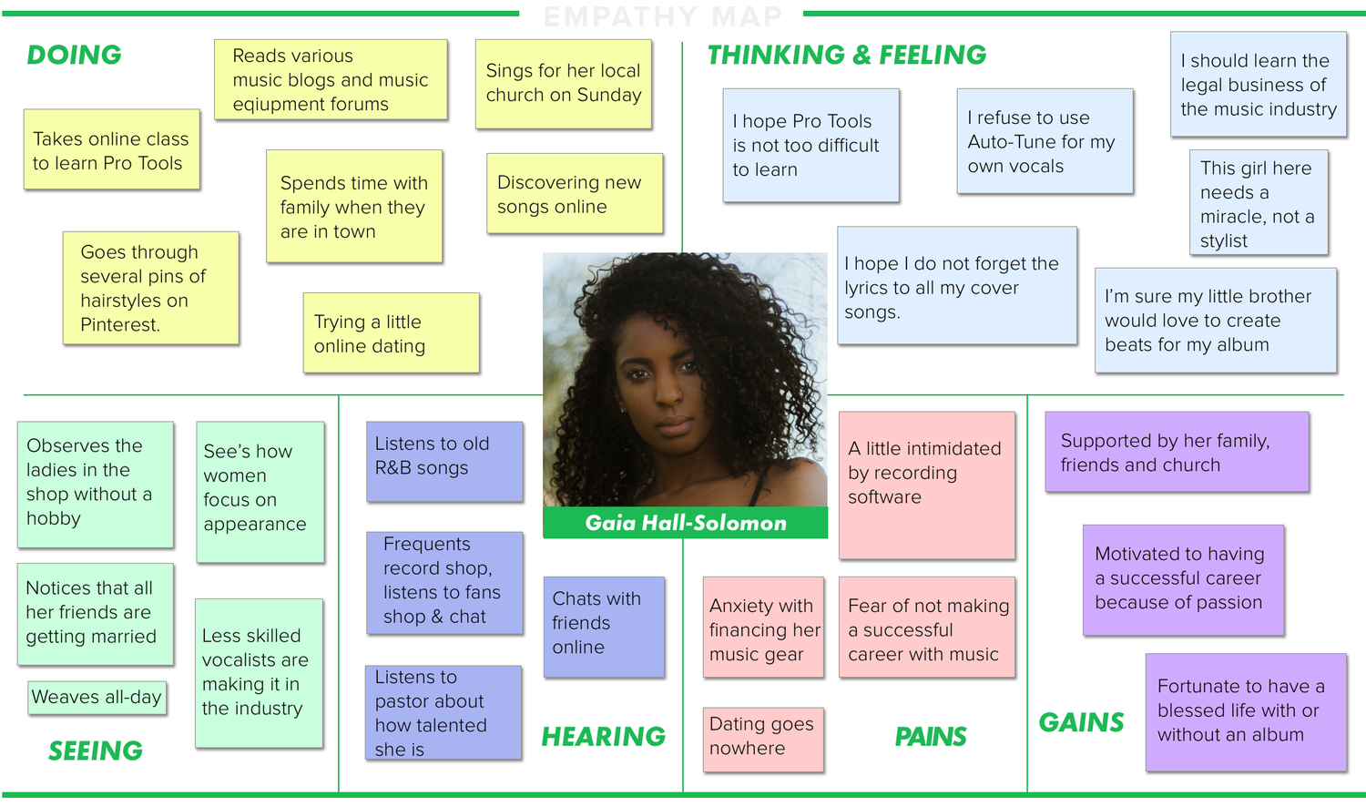
Research proved valuable and brought to light some important data. The information gathered here was used to create a persona for us to reference when designing to maintain our human element.
PERSONA CREATION
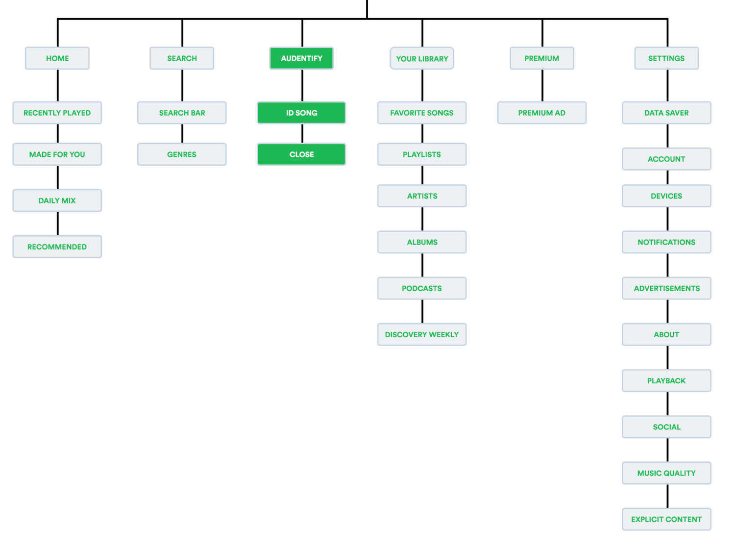
SITEMAP CREATION
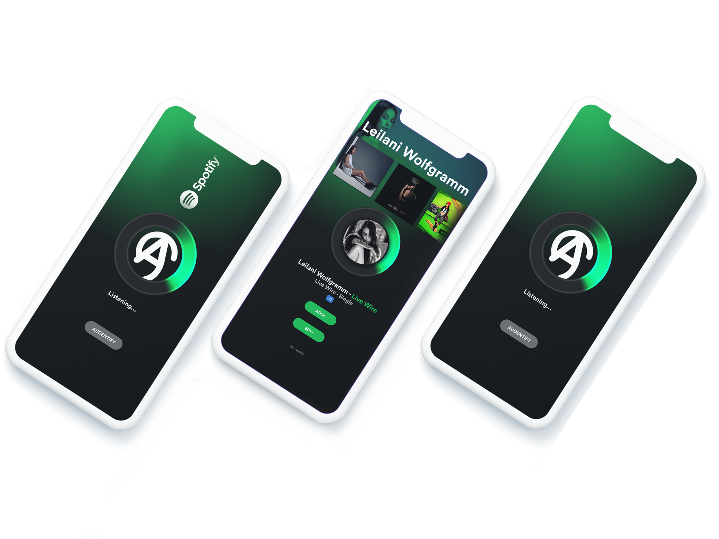
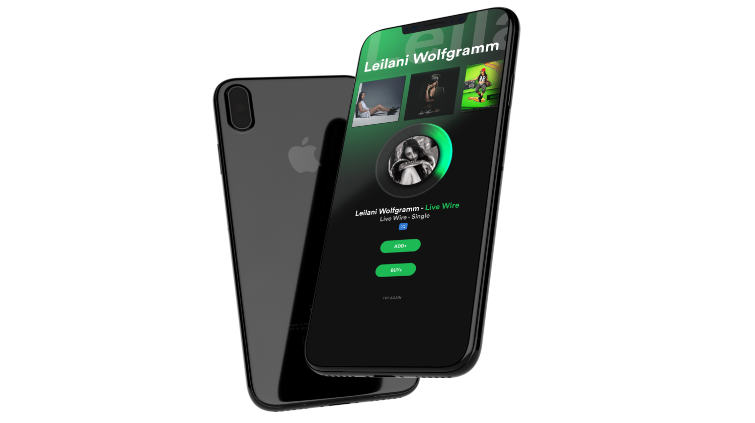
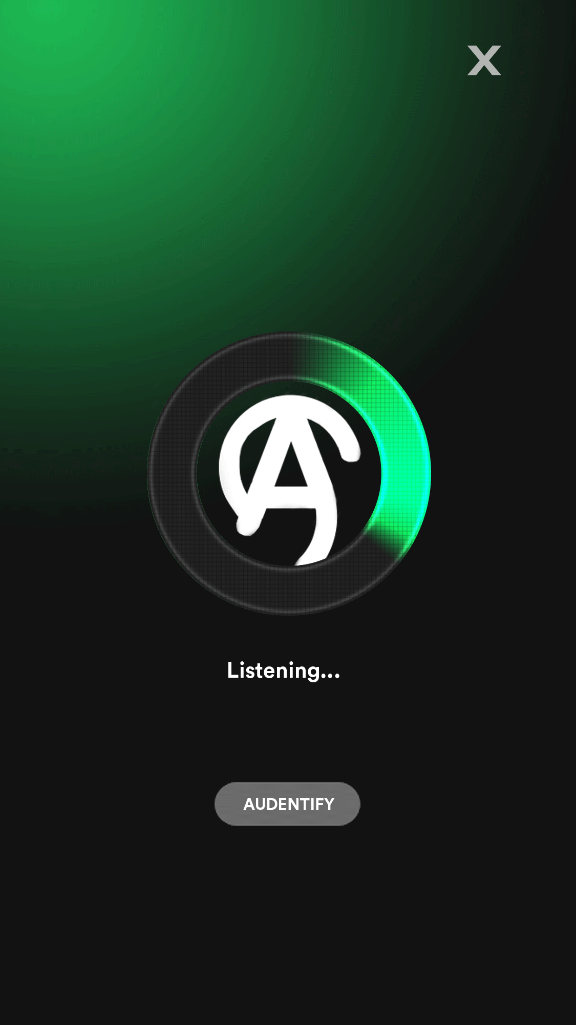
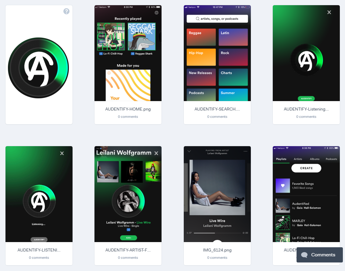
I was excited to explore the current setup and was up for a challenge. However, the most efficient placement for an audio identifier ended up being on the top of a rather extensive pre-existing sitemap. The integration went smoothly and all testers reported that it was easily accessible and could respond quickly enough to catch a 3-minute song on the radio.
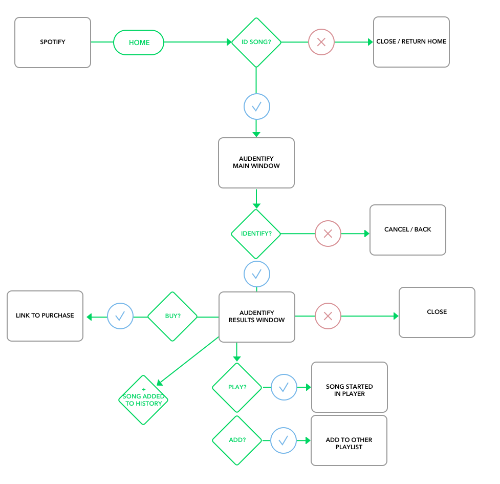
USER FLOW
Our persona works as a hairstylist and has the radio on at all times. One very probable scanario is that she hears an awesome song being played and would really like to know who that voice belongs to. Spotify is a powerhouse for music right now and I'm not just saying that. I was a subscriber way before this case study. Being able to use the playlist system as a means of collecting a "History" proved to be incredibly useful. Full-editable and sharable. It was really nice to work inside of an already awesome design system.
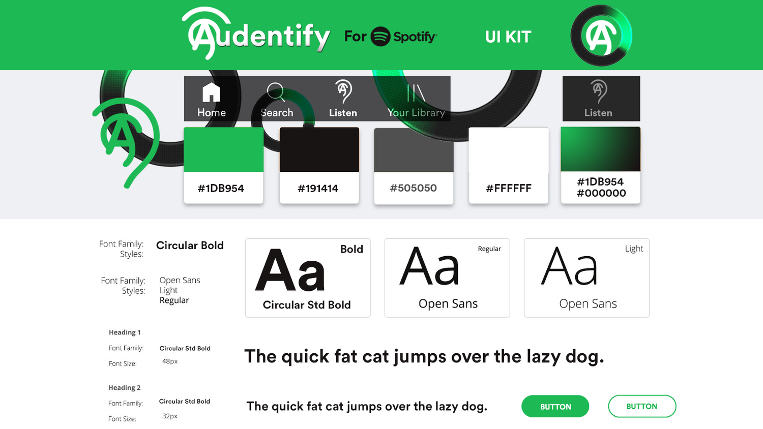
UI DESIGN
There is always a challenge of working within a specific set of branding guidelines and Spotify was no different. There were many do's and don't do's. But for the most part, Spotify was really fun to design for. That green color selection is top choice. The font-hunting was really neat. There were so many opinions as to what font spotify was using. Thanks to
FontfaceNinja for helping me find confidence in my choice.
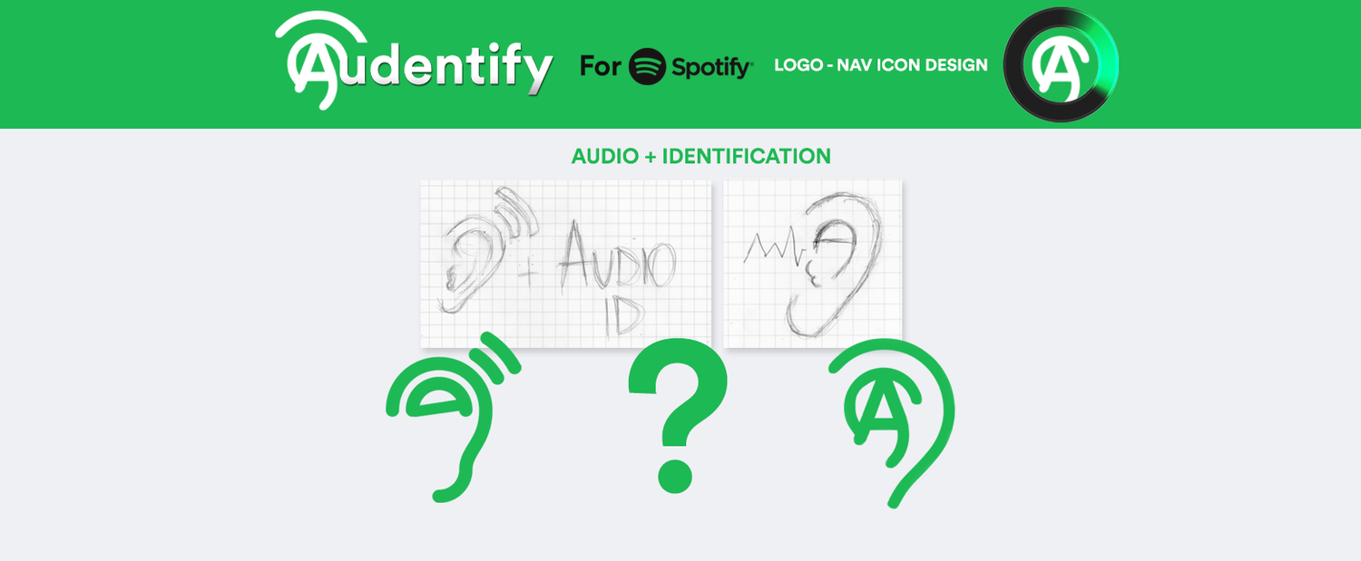
LOGO CREATION
It was incredibly fun to brainstorm and come up with a creative branding. After a few ideas that could not be pushed, we found an idea in my sketchbook that could. I knew I wanted some kind of ear mixed with a location service. I settled on using a sonar-style type of inspiration. I believe we were able to reach an identifiable logo within an already recognizable brand. Smooth integration.
WIREFRAMES
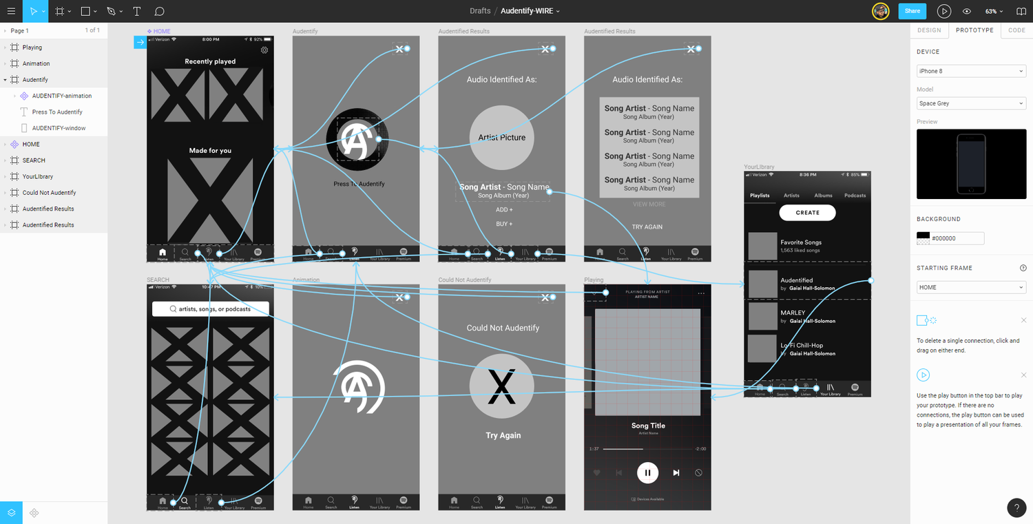
PROTOTYPE
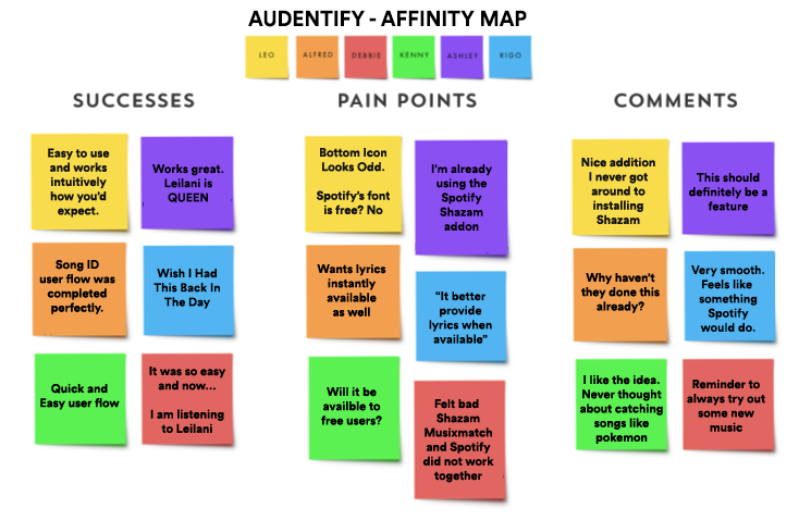
USABILITY TESTING
Once we have a functional prototype of our design, the best fixes and improvements can be discovered through user testing. Alongside affinity maps and other testing documentation, we can then iterate on our design to create a better and better version each time.

WIREFRAMES + HIGHER-FIDELITY PROTOTYPE
Please click on either of the above links to get a feel for the first wireframes and higher-fidelity prototype.
THANKS!

Thank you for reading about this case study.