THE PAWS DATABASE
Role: UX Researcher, UI Designer
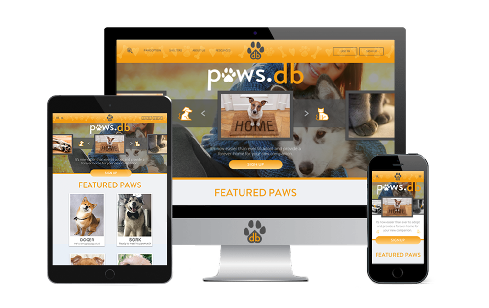
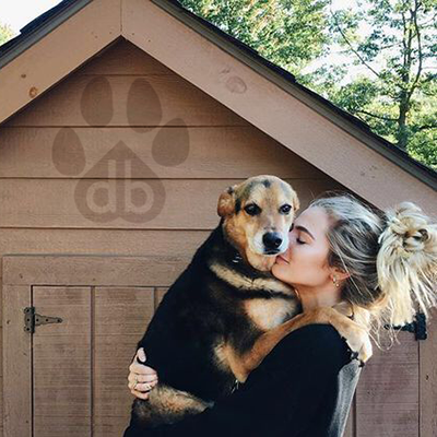
The (paws.db) association would like to create a responsive website to bring awareness and possibly higher adoption rates by partnering with shelters all over the country to create a modern and attractive database. They are looking to create a platform that allows users to view animals in any participating shelter across the country. This website should also have the easy ability for shelters to update the information. They would also like a re-branding of company name, and logo, colors scheme, and identity.

COMPETITIVE ANALYSIS
Our goals would be to obtain as much general information about the animal shelter business as possible before moving more in depth with user interviews and online surveys. Learn what information is sought after while looking for a pet, and also learn the user flow or more specifically where in the user flow our shoppers are coming in from. Gathering information on why some people prefer puppy mills or breeding, rather than adopting will prove to be useful as well.


Through our competitive analysis we gathered much information on the best structure and features for the database itself. This is now the time to get personal with the help of 1:1 user interviews.
1:1 PET OWNER INTERVIEWS
Discovering the habits and behaviors of our users will provide the information required to build a design created just for them. Learning their wants and needs (as well as their pain-points) will help create an easy and pleasant system to find, and ultimately purchase what products they require. Also learning what kind of products they already have or plan to have will give us a better insight into what insurance bundles make the most sense for this target demographic. I felt it was necessary to have actual conversations with some potential users and included 1-on-1 user interviews to our primary research.

For example, Alfred found three dogs tied up to a dumpster in a nearby neighborhood. He picked them up and took them to the vet for shots and registration. Not all rescues are happening inside of an agency - and 'not all our heroes wear capes'. There were many stories like this, and almost none involved an adoption service or agency. This was a surprise and is important to keep in mind.
PERSONA CREATION
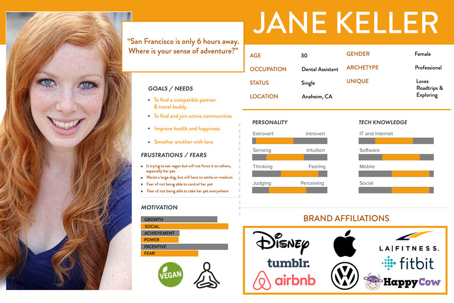
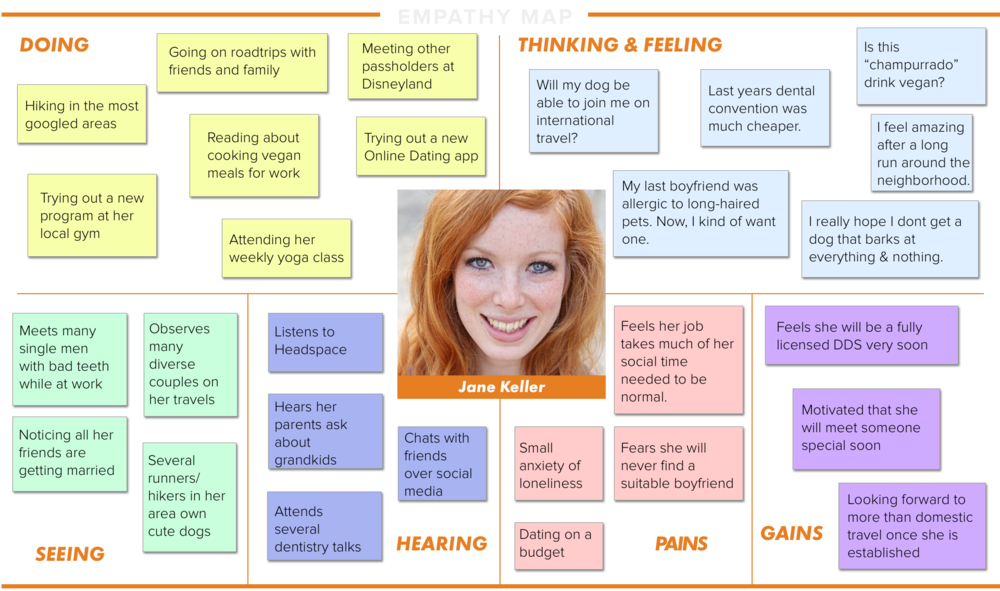
This takes us to our persona Jane. Women had a larger chunk of participation when it came to pet adoption. To explore the mind of our persona a little more, an empathy map was created to show what this adopter would normally hear, think, say, and do. This also helps us locate any frustrations or pain-points.


SITEMAP CREATION
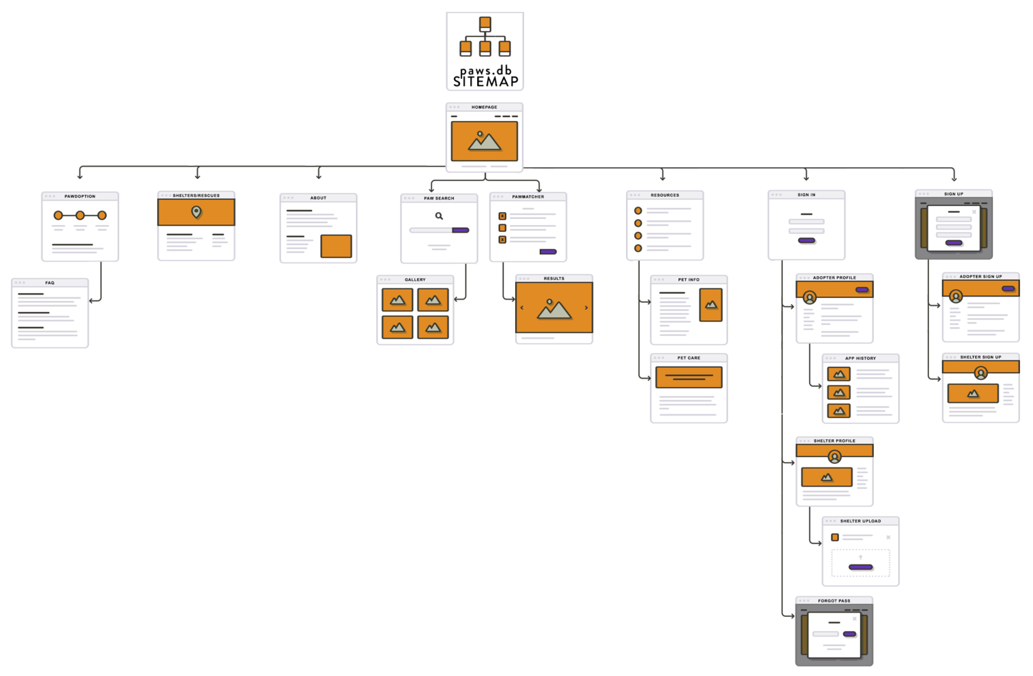
The average pet adoption sitemap structure was basic and straightforward. This made it simple to create an easy-to-navigate sitemap of our own. We are including all the knowledge bases and information pages that our competitors offer. It's important that our adopter's are well-informed.

UI DESIGN
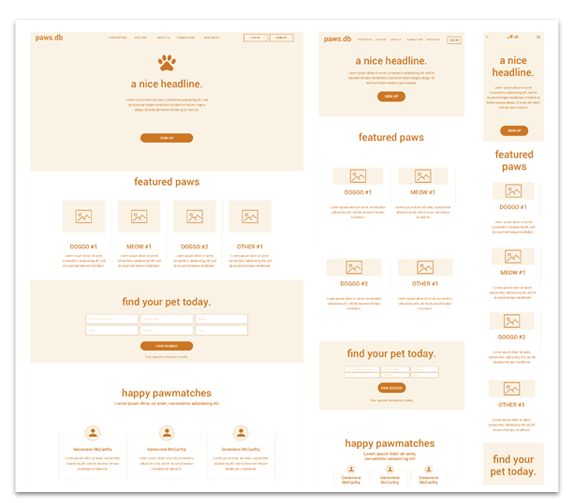
follow a cycle of wireframing, prototyping, then perform usability testing to get a better understanding of how to create a better experience for our users through as many iterations as time allowed before the product goes live. This is where we put research data to good use and make design decisions based on our users.
LOGO CREATION
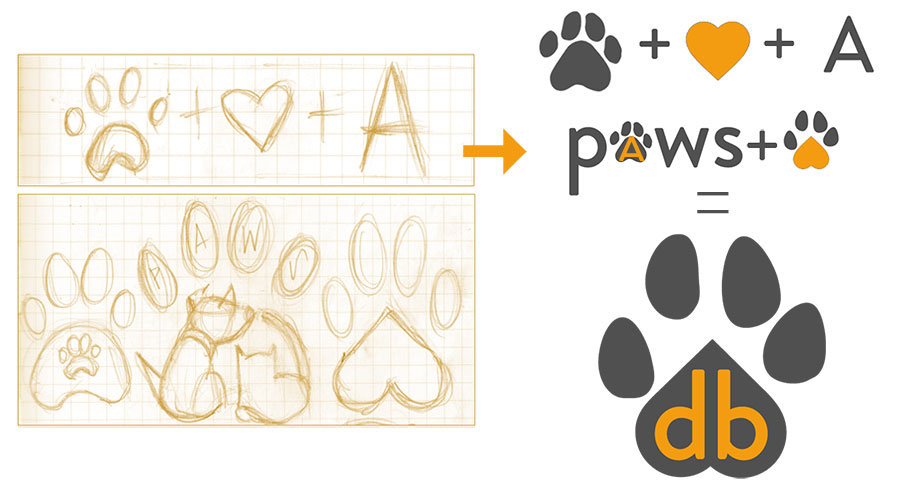
Since our product is called paws, I felt we must really get the paw-print in there. With a little time, my notebook went from cartoon to simple icons. It worked out that the less complicated design was better suited for our design. Flipping the heart around to become the pad of the paw was to be the main idea. Discovering that 'db' itself looks like cat-paws was just too adorable of a coincidence. This is the reason behind the ".db" portion of the wordmark. Logo creation was very fun, until you realize that your idea may not be so original after all. We created a visual representation of a very old and popular subject matter that is bound to have similarities.


UI KIT
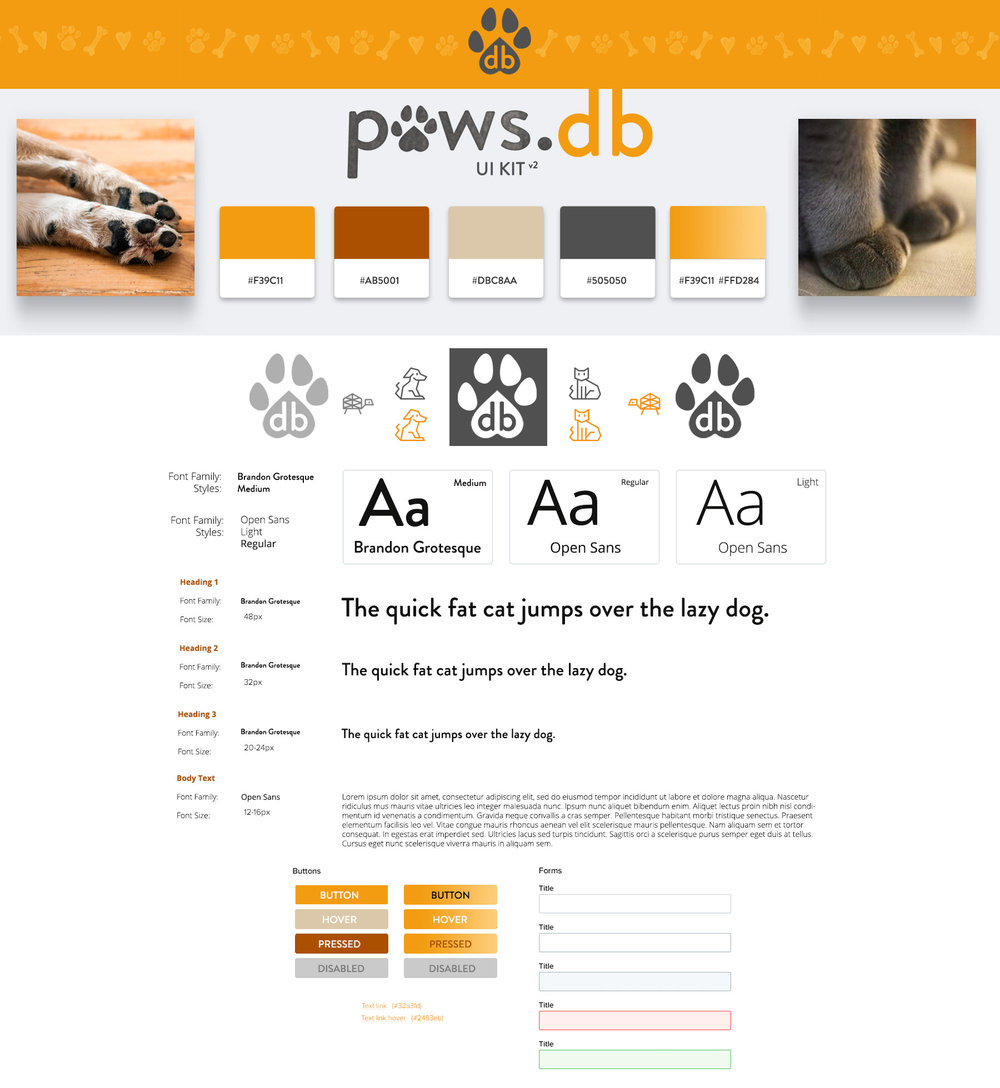
The creation of the UI was incredibly fun. I had never experimented with an orange color scheme until this project. I felt I wanted to be bright and energetic feeling of meeting a friends pet - in contrast to the sad reality of our mission statement.

USABILITY TESTING
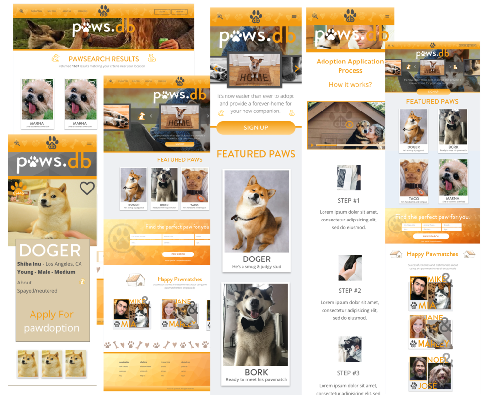
Once we have a functional prototype of our design, the best fixes and improvements can be discovered through user testing. Alongside affinity maps and other testing documentation, we can then iterate on our design to create a better and better version each time.


MOBILE PROTOTYPE
Please click on either of the above link to get a feel for the first mobile prototype.

THANKS!
Thank you for reading about this case study.

