KAUS INSURANCE
Role: UX Researcher, UI Designer
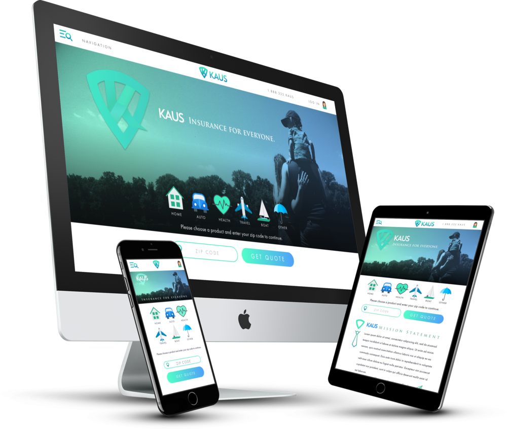
KAUS is a large multi-insurance company that has mainly covered small businesses for over 30+ years. We are looking to expand their 350 insurance offerings to be available for individuals as well as business. We are looking to modernize their website and attract the Millennial demographic. They wish to offer bundled packages and are interested to know which products would best suit their needs.
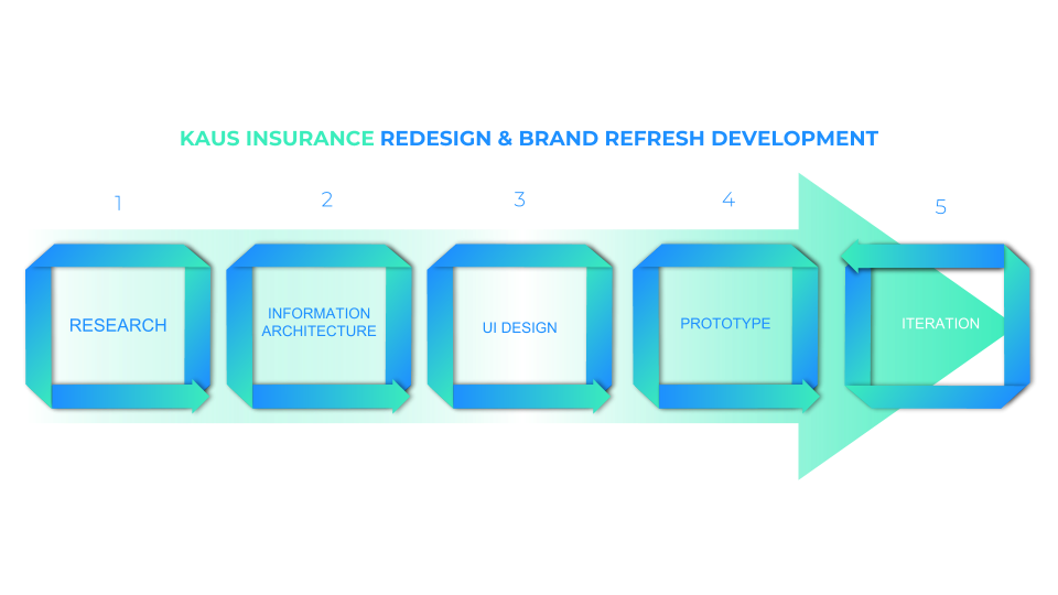
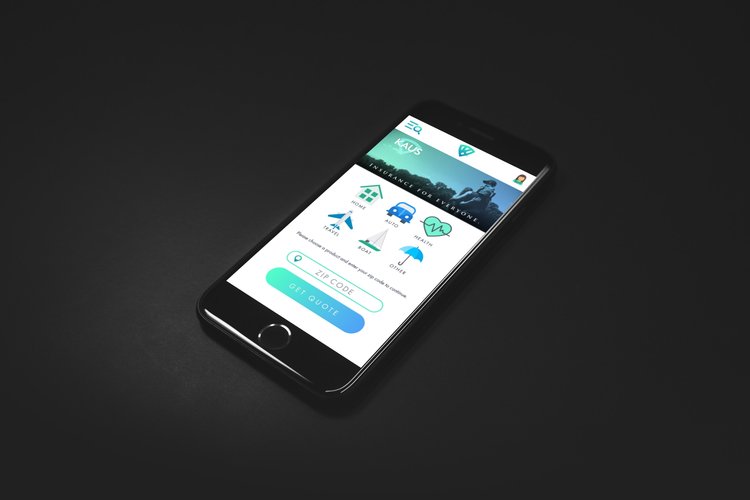
KAUS requires a redesigned responsive website, research data on the target demographic, and a brand refresh with a new logo. I set up 5 stages that will help create the most efficient design. We must first empathize and understand our users.

COMPETITIVE ANALYSIS
I set my sight on the most established agencies that would currently attract our desired users. After completing the competitive analysis, we were able to see what is working out well for our competitor's, and also what may not be worth our time & investment. This research not only helped core functionality, but many design patterns were inspired from these very well-designed websites.

1:1 USER INTERVIEWS
Discovering the habits and behaviors of our users will provide the information required to build a design created just for them. Learning their wants and needs (as well as their pain-points) will help create an easy and pleasant system to find, and ultimately purchase what products they require. Also learning what kind of products they already have or plan to have will give us a better insight into what insurance bundles make the most sense for this target demographic. I felt it was necessary to have actual conversations with some potential users and included 1-on-1 user interviews to our primary research.

PERSONA CREATION
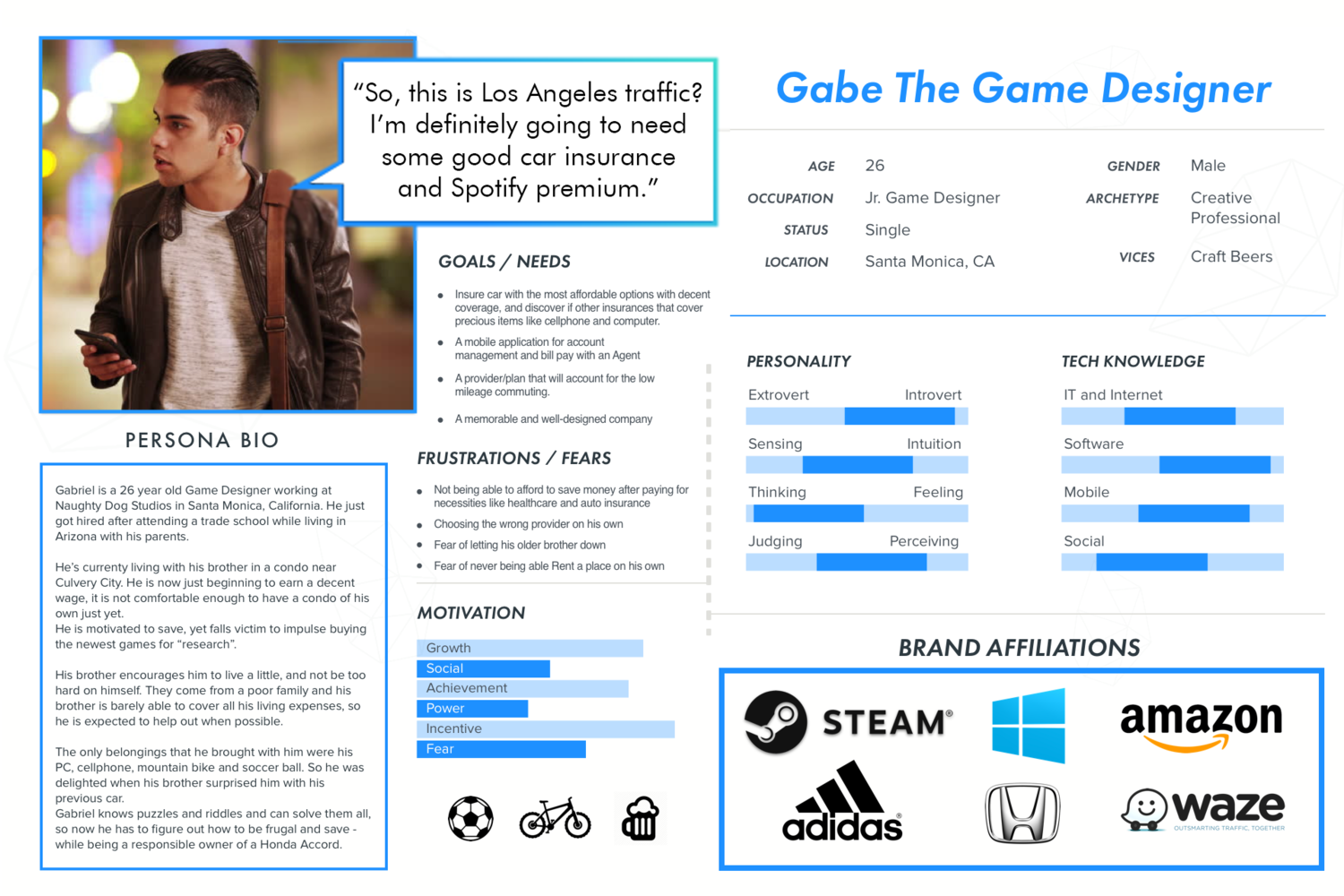
Research proved valuable and brought to light some unfortunate but important data. The millennial generation has it's challenges just as any other, but their statistics of being homeowners are eye-openers. Aside from viewing Health Insurance as a necessity, the only other insurances that they actively sought out were Auto Insurance, Renters Insurance and small plans covering electronics. The information gathered here was used to create a persona for us to reference when designing to maintain our human element.

SITEMAP CREATION
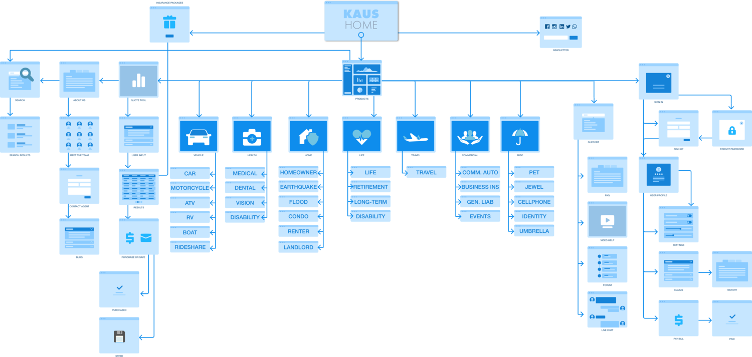
To gain an edge over our competitor's - I felt a cleaner and more intuitive navigation system would improve the site's usability. Using a card sorting technique with Optimal Workshop, I was able to construct a sitemap that had all popular products and features where the majority of users felt they belonged. I was able to cut down the initial index to six categories which could then be identified by modern and favorable icons on our new website.

UI DESIGN
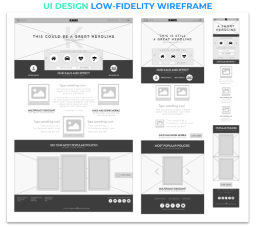
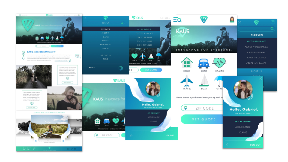
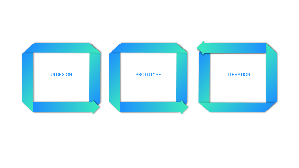
After research provides us with a strong foundation, the design fun may begin. I started with paper prototypes for myself as I created a low-fidelity wireframe for usability testing. This will then prompt our first iteration that begins our road to a viable and enjoyable product.
LOGO CREATION
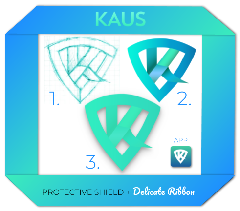
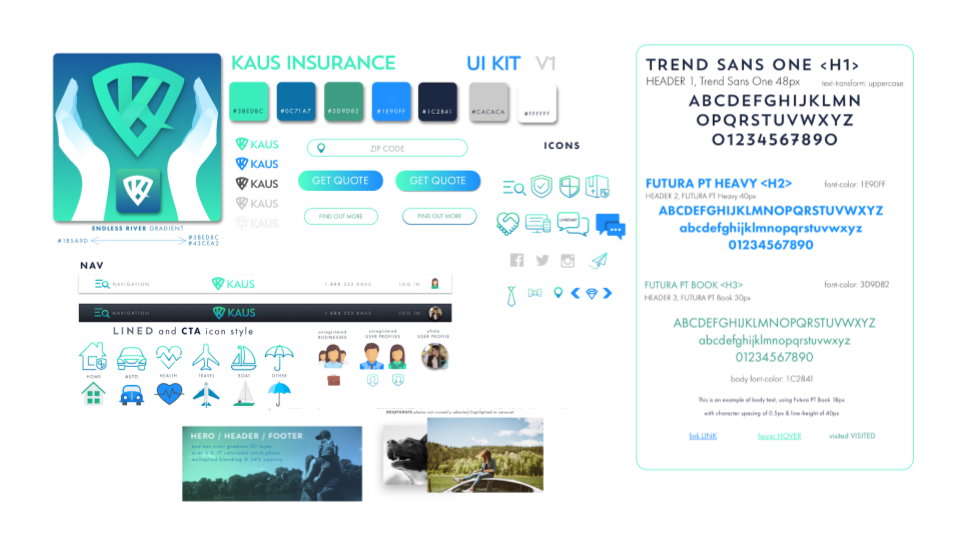
It was incredibly fun to brainstorm and come up with a creative branding. After a few ideas that could not be pushed, we found an idea in my sketchbook that could. Something gentle and soft that thrives behind a protective shield. This idea led to our shielded ribbon "K". After the logo won the hearts of colleagues and jedi mentors our KAUS UI Kit was developed.


USABILITY TESTING
Once we have a functional prototype of our design, the best fixes and improvements can be discovered through user testing. Alongside affinity maps and other testing documentation, we can then iterate on our design to create a better and better version each time.


DESKTOP PROTOTYPE + MOBILE PROTOTYPE
Please click on either of the above links to get a feel for the first prototype.

WHAT'S NEXT?
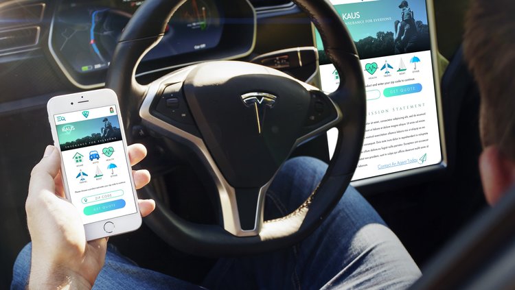
It's important to keep an eye to the future and I would like to see insurance applications installed on Tesla dashboards and perhaps some support for voice-navigation through devices like Amazon's Alexa.
THANKS!
Thank you for reading about this case study.

