GOOGLE ARIA
My Roll: Design Research, User Experience Designer
In this capstone I was challenged to design a healthcare app that allows users to manage, control, and improve their diabetes. The app will first be designed for Android devices which include the challenge of adhering to the Material Design and Google branding guidelines for Android. The Google ARIA is a combination of a wearable patch the size of an circular EKG sticker. With the ability to inject slow-acting insulin, the device will prove to be incredibly helpful for many users. The main goals were to research users who battle diabetes everyday and find the most efficient and useful ways to provide a helpful management system.
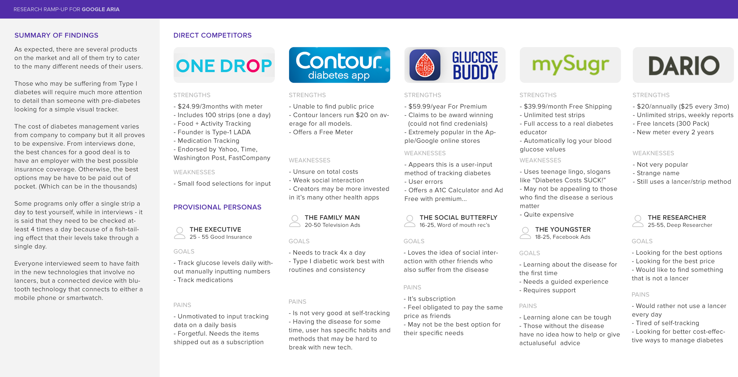
COMPETITIVE ANALYSIS
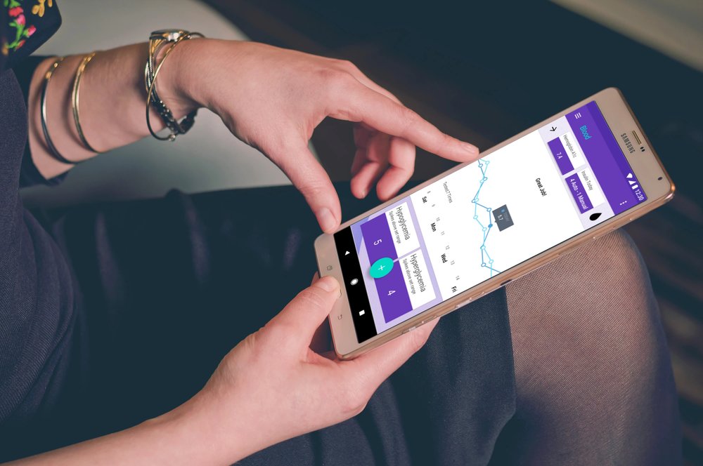
There is quite a large world of lancers, and pumps. Meters and Trackers. There are several options on the market that help manage diabetes. This is where the crucial user-data comes in. Diabetics absolutely hate having to bleed themselves everyday for testing. They also despise having to manually input extensive data on their own. This is where the ARIA truly shines. With it’s auto-injections and automated graphing for your doctor, your next visit would be an ease with the most accurate data delivered to your doc.
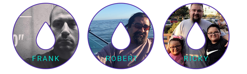
1:1 INTERVIEWS
Interviews in this capstone were absolutely key. Diabetes is a large and complex subject. I was able to understand what it’s like to have to learn very quickly what it is, how it’s hurting me, and how I can beat it. This is the whirlwind of emotions in itself, and then add having to learn about a disease you knew nothing about. This was Ricky’s world when he was told he “most likely” is diabetic. I was able to dig into a retired man who is learning to walk again with toes removed and loss of vision in one eye. I was also able to learn from the experiences of Frank who found out he had diabetes at the young age of 18, and got a feel for the length of the battle as he is now turning 40. All of these amazing participants gave me great information that led to crucial design decisions. The one unexpected part of this research was the emotions that I would feel learning about how my friends and family are suffering from diabetes.
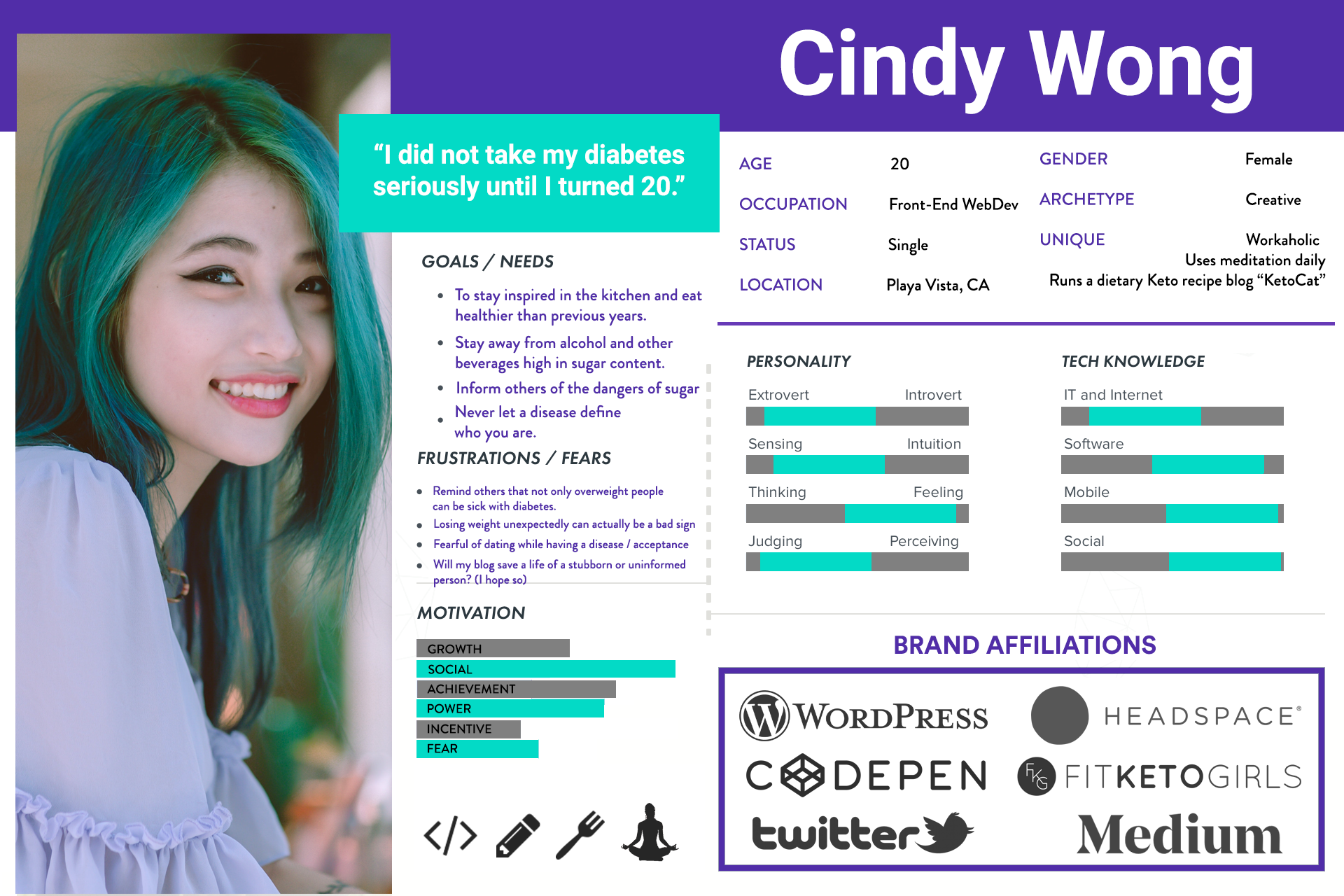
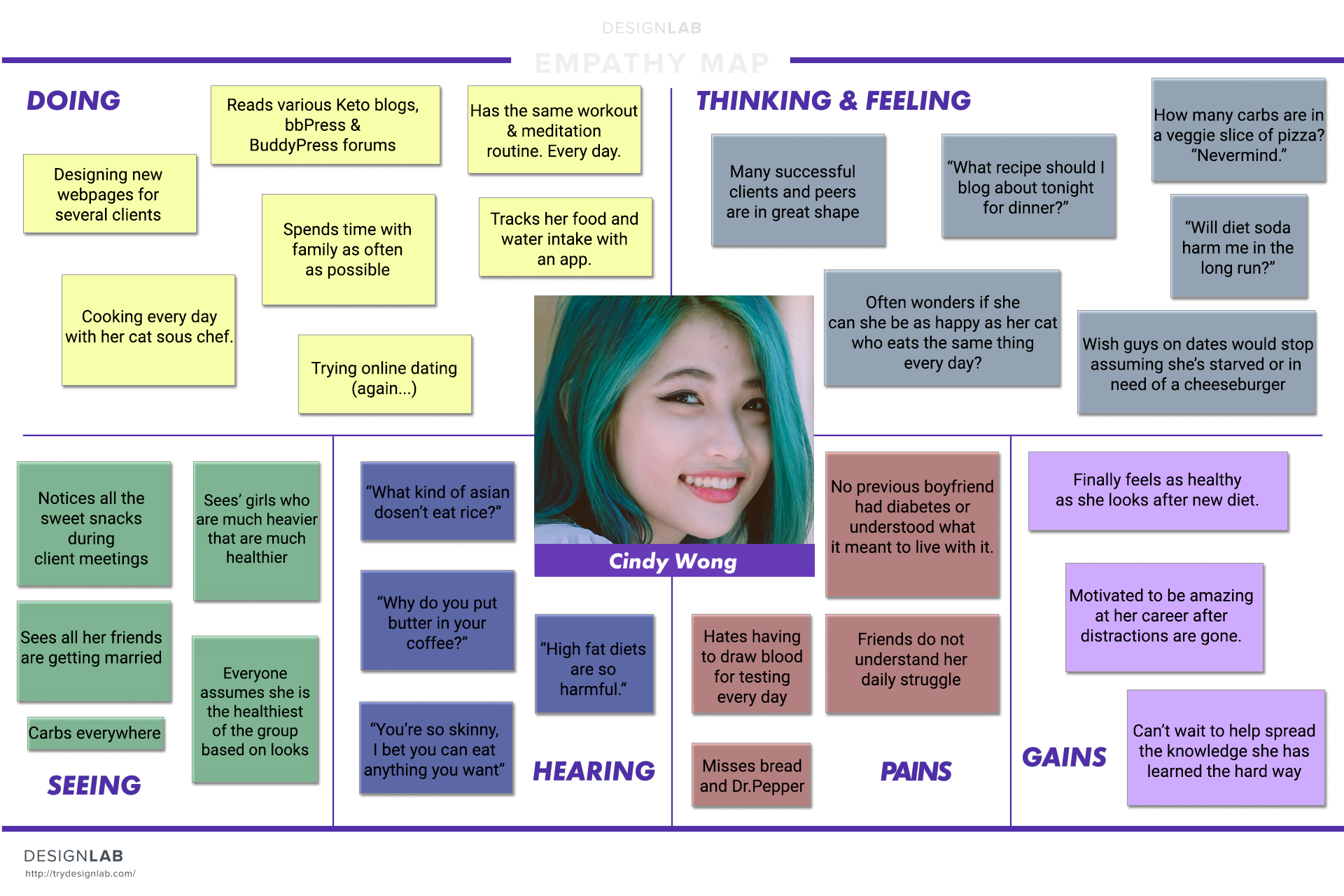
PERSONA CREATION
A persona was created with the primary Type I diabetic, but Type II and prediabetics were kept in mind. There is a stereotype about being obese and diabetic. From my user research, not all who have diabetes have led an obese lifestyle. I wanted to really crush the stereotypes and use someone who may appear completely healthy, yet struggles daily with diabetes. Men were the most forthcoming about their diabetes, and I felt the need to use a female to represent the quieter demographic.
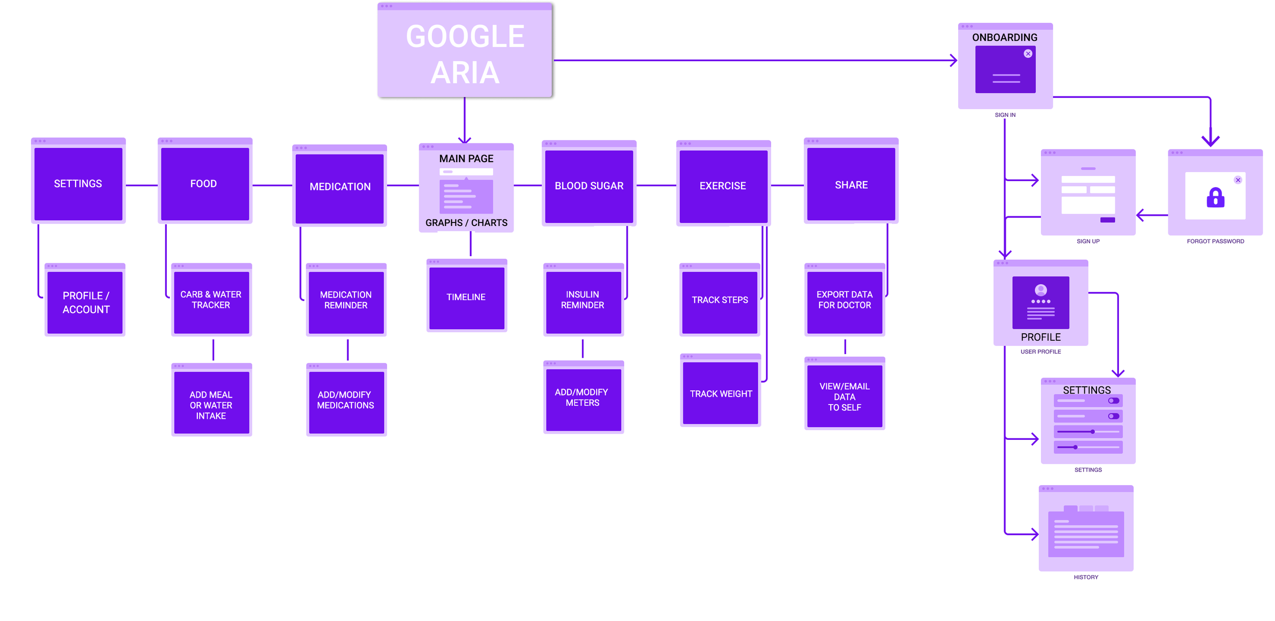
SITEMAP CREATION
Creating the information architecture for the ARIA was based on the competitive analysis conducted and also much of the user interview data. Learning the true information that users would like to see constantly was a huge help in creating the Homepage, Blood, and Medication layouts. From my experience, about half of the users did not feel completely confident about their knowledge on the disease. This is why I created an onboarding section to familiarize our users with their what, when’s, and why’s.
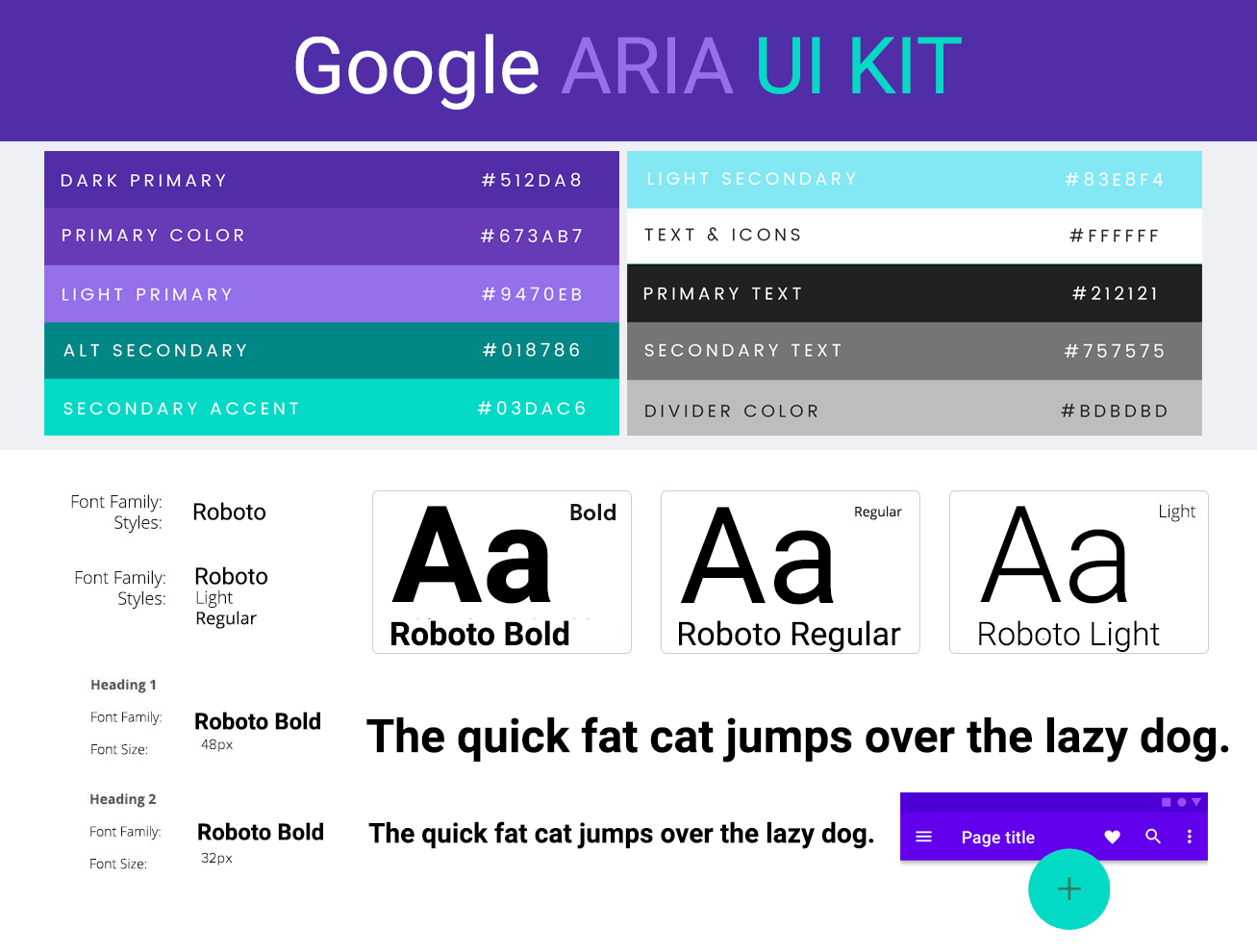
UI DESIGN
The design process is exciting as always and learning
Google Material Design was very interesting all by itself. While deciding on a color scheme, I really wanted to select a unique palette for diabetes. I also felt this was an opportunity to use colors that I may never use on my own. I found a pleasant experience using
Material Palette color picker.
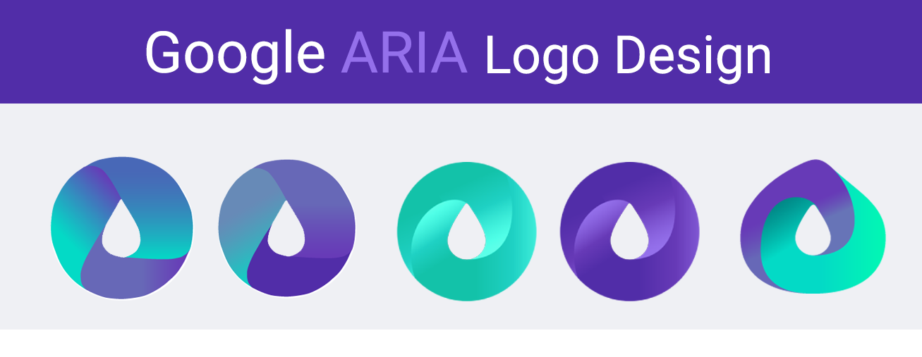
LOGO CREATION
The goals for logo creation were to explore the color purple and the idea of blood sugar. Inspired by the Google Drive logo, I once again tried a ribbon style logo but felt since I already designed a ribbon for the first capstone - I would explore a different texture. The Deep Purple Blood-drop was chosen as the strongest candidate.
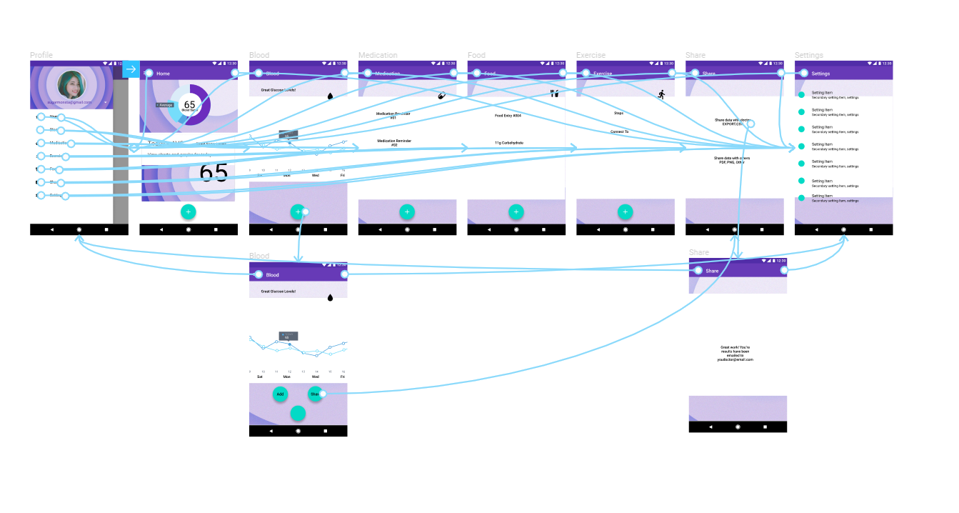
ARIA WIREFRAMES
The first wave of testing was successful in both navigation and aesthetics. However, this is where I learn that about 80% of men dislike purple. I had no idea it was such a disliked color by males and that was predominately who my testers were. So, unfortunately the most requested change was the color. I feel people really get attached to colors, and each may have their favorites, so I then decided to add a feature that can colorize their Material Design to their choice of basic RGB colors.
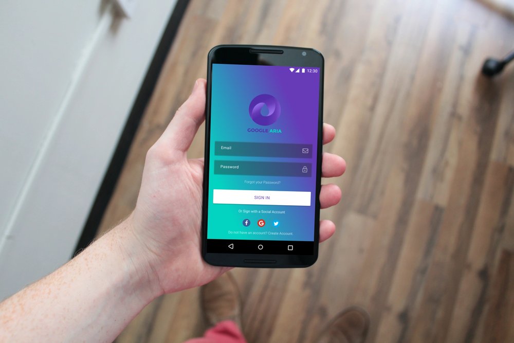
ARIA PROTOTYPE
WIREFRAMES - HIGHER-FIDELITY PROTOTYPE
Please click on either of the above link to get a feel for the first mobile prototype.
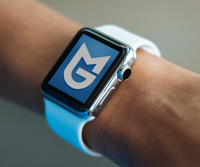
WHAT'S NEXT?
I believe the automatic next step would be to create app versions for the smartwatch. Many times we find ourselves without our phone, whether it’s charging at home or we are out for a morning run. This next step would give added peace of mind that you are in a safe blood sugar range just before your next meal.
THANKS!
Thank you for reading about this case study.